Kristen, over at Retro Café, is having a fantastic blog giveaway!
Be sure to visit and have a peek at all the goodies you could win.
Wednesday, October 15, 2008


Sunday, October 05, 2008
Rock, Metal, Rust?
I've been having a ball with a technique I saw somewhere on the web using gesso and aluminum foil and adding inks and paints on top of it. It's tough to get good photos of this kind of thing, because of all the glare, but I'll give it a try here.
First, you take a piece of mat board or illustration board and coat with gesso. Then lay strips of foil in the wet gesso, and push the gesso up around the edges of the foil to be sure it's well adhered. I also added bits of crumpled tissue paper and some pieces of the woven-type butcher paper Cheap Joe's wraps all their shipments in. While it's still wet, you sprinkle on sand, salt, and sugar.


Let these dry completely, which can take a day or so. Be careful where you put the one with sugar on it! I left it outside on my deck over night, and it was covered with ants in the morning!
Now the really fun part begins. Take those little re-inkers for stamp pads, calligraphy ink, or any other liquidy color you have around, and drop spots all over the sheet. Spray with a little water, then set vertical and let it run. Watch what happens in the areas of salt and sugar. Turn the sheet around to get the drips to go where you want them, especially across the foil. Let that layer dry a bit, then add some walnut ink spray, Adirondak Color Wash, or whatever you want to try. I think some Pearl Ex mixed with watercolor would be great. You can also drop on fluid acrylics with an eyedropper. Spray with water again and let it flow!
Here are a couple of in-progress shots:


After this part was dry, I also rubbed on some Rub 'n Buff in various colors, scratched in colored pencils and graphite, and worked in some oil pastel in some areas. Oh, and a fantastic addition is some drybrushing of Micaceous Iron Oxide acrylic paint!
I cut the sheets into 3x3, 3x6, and 6x6 tiles for use in a "squares" series I'm working on. Stay tuned for photos of finished pieces!


This is the kind of artistic process that really gets me out of my head and into the flow, just letting the materials lead me and I watch where they go.
First, you take a piece of mat board or illustration board and coat with gesso. Then lay strips of foil in the wet gesso, and push the gesso up around the edges of the foil to be sure it's well adhered. I also added bits of crumpled tissue paper and some pieces of the woven-type butcher paper Cheap Joe's wraps all their shipments in. While it's still wet, you sprinkle on sand, salt, and sugar.


Let these dry completely, which can take a day or so. Be careful where you put the one with sugar on it! I left it outside on my deck over night, and it was covered with ants in the morning!
Now the really fun part begins. Take those little re-inkers for stamp pads, calligraphy ink, or any other liquidy color you have around, and drop spots all over the sheet. Spray with a little water, then set vertical and let it run. Watch what happens in the areas of salt and sugar. Turn the sheet around to get the drips to go where you want them, especially across the foil. Let that layer dry a bit, then add some walnut ink spray, Adirondak Color Wash, or whatever you want to try. I think some Pearl Ex mixed with watercolor would be great. You can also drop on fluid acrylics with an eyedropper. Spray with water again and let it flow!
Here are a couple of in-progress shots:


After this part was dry, I also rubbed on some Rub 'n Buff in various colors, scratched in colored pencils and graphite, and worked in some oil pastel in some areas. Oh, and a fantastic addition is some drybrushing of Micaceous Iron Oxide acrylic paint!
I cut the sheets into 3x3, 3x6, and 6x6 tiles for use in a "squares" series I'm working on. Stay tuned for photos of finished pieces!


This is the kind of artistic process that really gets me out of my head and into the flow, just letting the materials lead me and I watch where they go.
Taming the Art Room!
Is there ANY art form out there more material-intensive than mixed media??? I can only think of one, perhaps: assemblage. Which is why I've avoided that one as much as possible, though I do have one box of 3D junk and a little shadow box into which I've been dropping intriguing little gems. I know, I know: It's a slippery slope!
Anyway, I can't believe it's been TWO months since I posted here. Illness and general life busy-ness have intervened, but I believe (hope) I'm back into the creative flow.
My goal these past weeks has been to tame the beast that has become my art room. To that end, we cleared a cabinet in the garage to house all the materials that I have set aside for teaching art classes, and got all that stuff put away. It made surprisingly little difference in the room, but it was a start.
Then, Mark helped me tame the most out-of-control corner of the room, where I had stacked all my large, flat items vertically and they were constantly falling all over the place and I ended up piling things on top of them. I wish I had taken a "before" photo, but here are the afters:


We built that vertical file unit with particle board, and I LOVE it! Not only does it keep all the big, flat stuff organized and accessible, but it also gives me three little stepped shelves to clutter up!
Then, my mom brought me this fantastic tiered lazy Susan thingy, so I corralled all my pens and odds and ends on the table behind my work table, and reorganized all my brushes and other tool-type stuff. Now I can actually see the surface of the table again!

I now feel like I can move around in there and find things easily, which is essential for me when I create. Whew.
Anyway, I can't believe it's been TWO months since I posted here. Illness and general life busy-ness have intervened, but I believe (hope) I'm back into the creative flow.
My goal these past weeks has been to tame the beast that has become my art room. To that end, we cleared a cabinet in the garage to house all the materials that I have set aside for teaching art classes, and got all that stuff put away. It made surprisingly little difference in the room, but it was a start.
Then, Mark helped me tame the most out-of-control corner of the room, where I had stacked all my large, flat items vertically and they were constantly falling all over the place and I ended up piling things on top of them. I wish I had taken a "before" photo, but here are the afters:


We built that vertical file unit with particle board, and I LOVE it! Not only does it keep all the big, flat stuff organized and accessible, but it also gives me three little stepped shelves to clutter up!
Then, my mom brought me this fantastic tiered lazy Susan thingy, so I corralled all my pens and odds and ends on the table behind my work table, and reorganized all my brushes and other tool-type stuff. Now I can actually see the surface of the table again!

I now feel like I can move around in there and find things easily, which is essential for me when I create. Whew.
Tuesday, August 12, 2008
More Nature Journal Class Photos
My co-teacher Melissa just posted her class photos here.
Looking through them helped me to recall and reflect on the varied approaches the kids brought to their books and boxes, and I decided to recap them here, so I don't lose them.
Hannah is one of the most patient artists I've ever seen at work. She insisted on drawing and creating everything for her book by hand, and fully embraced the complimentary colors idea. She drew a progression of a wave break on four of her book panels, and the other side of her book included flaps which revealed hand-drawn images on every panel.


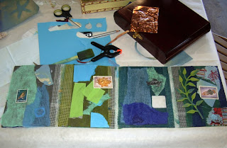
Emma decided on an underwater theme and stuck to it throughout her book. She was intrigued with the vintage postage stamps I provided that had images of fish on them, and used them to great advantage on her pages. She created wonderful underwater images by sticking with a gorgeous palette of blues and greens.


Ryan was intrigued by the idea of adding texture (sand and 3D items) and scents (teabags filled with cinnamon bark and lavender) to his book. One side of his book shows a progression of views of the same beach scene: from the beach, under water, from the sky, and looking back at the beach as if from a boat. The other side shows things you can do on the beach. His box is a representation of the beach view looking out over your own feet as you lie back and enjoy!


Jenna decided to use birds as her theme, and she has clearly begun to understand the idea of effective composition. Her juxtapositions of colors and interesting layouts are a treat for the eye. She also captured the feeling of looking up at birds against tree branches and sky.


Rebecca was the only student who decided to construct her book in a vertical format. It doesn't show in the photo, but the top panel has a copper wire loop with which she can hang the book on a wall. She also chose a beach theme, and cleverly hid an image of a starfish on each panel. The colors she chose for her box include stunning purples that evoke a sunset.


Natalie chose to focus her book on her favorite animal: dogs. She depicts dogs playing on the beach, and if you look closely, you can see that she's added wings to the dog image she embossed on copper for the top of her box. She took naturally to the idea of collaging text pages with colored mulberry paper over them for depth, and had a great time adding acrylic paint to just about every page and the entire inside of her box.


Harmony has a long-standing love of bee images, and devoted her book and box to them. She used a fantastic twist on the traditional black and yellow theme for bees, using copper instead of yellow on her box and some of her pages. One of her panels includes a large image of a hand-drawn bee on a dynamic black and yellow background, and one includes a bee image from a napkin, which she made into opening doors that reveal a bee embossed into copper. She also cut out a bee image and laid it on copper mesh, then sprayed the mesh with liver of sulfer, resulting in a wonderful masked image.


Maddie's theme was the sky. Her panels depict the sky at various times of day and night. In one panel, she cleverly used colored sand to represent a sunset. Images of suns and moons are used throughout her book and a beautiful sun is embossed in copper on the top of her box. This theme gave her a chance to explore a wide range of colors, which she used skillfully to give the feel of the light at different times of day.


It was a delight to work with these kids. Teaching them is so easy; I feel like all I have to do is provide some materials and techniques, and they just take off. They truly inspire me.
Looking through them helped me to recall and reflect on the varied approaches the kids brought to their books and boxes, and I decided to recap them here, so I don't lose them.
Hannah is one of the most patient artists I've ever seen at work. She insisted on drawing and creating everything for her book by hand, and fully embraced the complimentary colors idea. She drew a progression of a wave break on four of her book panels, and the other side of her book included flaps which revealed hand-drawn images on every panel.


Emma decided on an underwater theme and stuck to it throughout her book. She was intrigued with the vintage postage stamps I provided that had images of fish on them, and used them to great advantage on her pages. She created wonderful underwater images by sticking with a gorgeous palette of blues and greens.


Ryan was intrigued by the idea of adding texture (sand and 3D items) and scents (teabags filled with cinnamon bark and lavender) to his book. One side of his book shows a progression of views of the same beach scene: from the beach, under water, from the sky, and looking back at the beach as if from a boat. The other side shows things you can do on the beach. His box is a representation of the beach view looking out over your own feet as you lie back and enjoy!


Jenna decided to use birds as her theme, and she has clearly begun to understand the idea of effective composition. Her juxtapositions of colors and interesting layouts are a treat for the eye. She also captured the feeling of looking up at birds against tree branches and sky.


Rebecca was the only student who decided to construct her book in a vertical format. It doesn't show in the photo, but the top panel has a copper wire loop with which she can hang the book on a wall. She also chose a beach theme, and cleverly hid an image of a starfish on each panel. The colors she chose for her box include stunning purples that evoke a sunset.


Natalie chose to focus her book on her favorite animal: dogs. She depicts dogs playing on the beach, and if you look closely, you can see that she's added wings to the dog image she embossed on copper for the top of her box. She took naturally to the idea of collaging text pages with colored mulberry paper over them for depth, and had a great time adding acrylic paint to just about every page and the entire inside of her box.


Harmony has a long-standing love of bee images, and devoted her book and box to them. She used a fantastic twist on the traditional black and yellow theme for bees, using copper instead of yellow on her box and some of her pages. One of her panels includes a large image of a hand-drawn bee on a dynamic black and yellow background, and one includes a bee image from a napkin, which she made into opening doors that reveal a bee embossed into copper. She also cut out a bee image and laid it on copper mesh, then sprayed the mesh with liver of sulfer, resulting in a wonderful masked image.


Maddie's theme was the sky. Her panels depict the sky at various times of day and night. In one panel, she cleverly used colored sand to represent a sunset. Images of suns and moons are used throughout her book and a beautiful sun is embossed in copper on the top of her box. This theme gave her a chance to explore a wide range of colors, which she used skillfully to give the feel of the light at different times of day.


It was a delight to work with these kids. Teaching them is so easy; I feel like all I have to do is provide some materials and techniques, and they just take off. They truly inspire me.
Sunday, August 10, 2008
Kids Wow us Again in Nature Journal Class
Melissa and I taught an art camp once again last week. Four hours a day, five days in a row, and the focus, patience, commitment, and talent of these kids blew us away!
Here are a few photos. For more, go here.


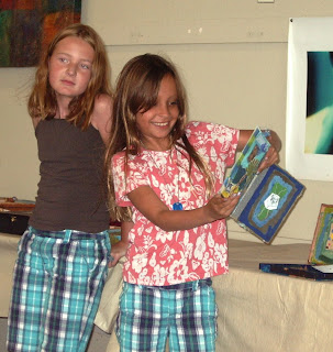
These were taken as the kids presented their books to all the parents on the last day:



And here's the entire gang, teachers included, with finished books:

Here are a few photos. For more, go here.


These were taken as the kids presented their books to all the parents on the last day:


And here's the entire gang, teachers included, with finished books:

Wednesday, August 06, 2008
Bags and More Bags
Somehow I just can't stop making bags. While my sister-in-law was here recently, we worked on some sewing projects, and these are two of the items I created. Bev brought her super-computerized sewing machine, her serger, AND her embroidery machine all the way down from Redding. It looked like a sweat shop in our living room!
First we worked on recycled wool items and I made this backpack:


I made a couple more recycled wool items, but I can't show them here yet because they're going to be Xmas presents.
We had a ball painting canvas and stamping it with foam stamps and acrylic paint, them made some of it into canvas totes:


I'm using this one for a knitting bag, but the other canvas I painted will also become some Xmas gifts. Hey, I've got to do SOMETHING with all this stuff I make!
First we worked on recycled wool items and I made this backpack:


I made a couple more recycled wool items, but I can't show them here yet because they're going to be Xmas presents.
We had a ball painting canvas and stamping it with foam stamps and acrylic paint, them made some of it into canvas totes:


I'm using this one for a knitting bag, but the other canvas I painted will also become some Xmas gifts. Hey, I've got to do SOMETHING with all this stuff I make!
Tuesday, August 05, 2008
Wow, What a Yard Sale Surprise
I bought a little box of some vintage postcards at a yard sale the other day, and when I went through them, I found this little gem in the bottom of the box:

It looks to me like a cashier's check from 1840 for $1000, and it's never been cashed. Now I need to get somebody who knows something about antique documents to take a look at this for me. If you know anyone . . .

It looks to me like a cashier's check from 1840 for $1000, and it's never been cashed. Now I need to get somebody who knows something about antique documents to take a look at this for me. If you know anyone . . .
I Learned Cables!
I finally learned how to knit cables. Just finished this simple scarf, and I'm anxious to get on to more intricate cable patterns using smaller neeedles.


Sunday, July 13, 2008
Nature Journal Class Sample
I finally finished my sample book and box for the nature journal class Melissa and I are teaching August 4-8 at Vita Art Center in Ventura.
I made a bunch of leaf prints and in the process discovered that Lumiere metallic paints and gel medium coat the leaves enough to preserve them. Or I think they do! Time will tell.
Here are LOTS of photos (click on each photo to enlarge):


I think it turned out pretty well!
I made a bunch of leaf prints and in the process discovered that Lumiere metallic paints and gel medium coat the leaves enough to preserve them. Or I think they do! Time will tell.
Here are LOTS of photos (click on each photo to enlarge):


I think it turned out pretty well!
Subscribe to:
Posts (Atom)